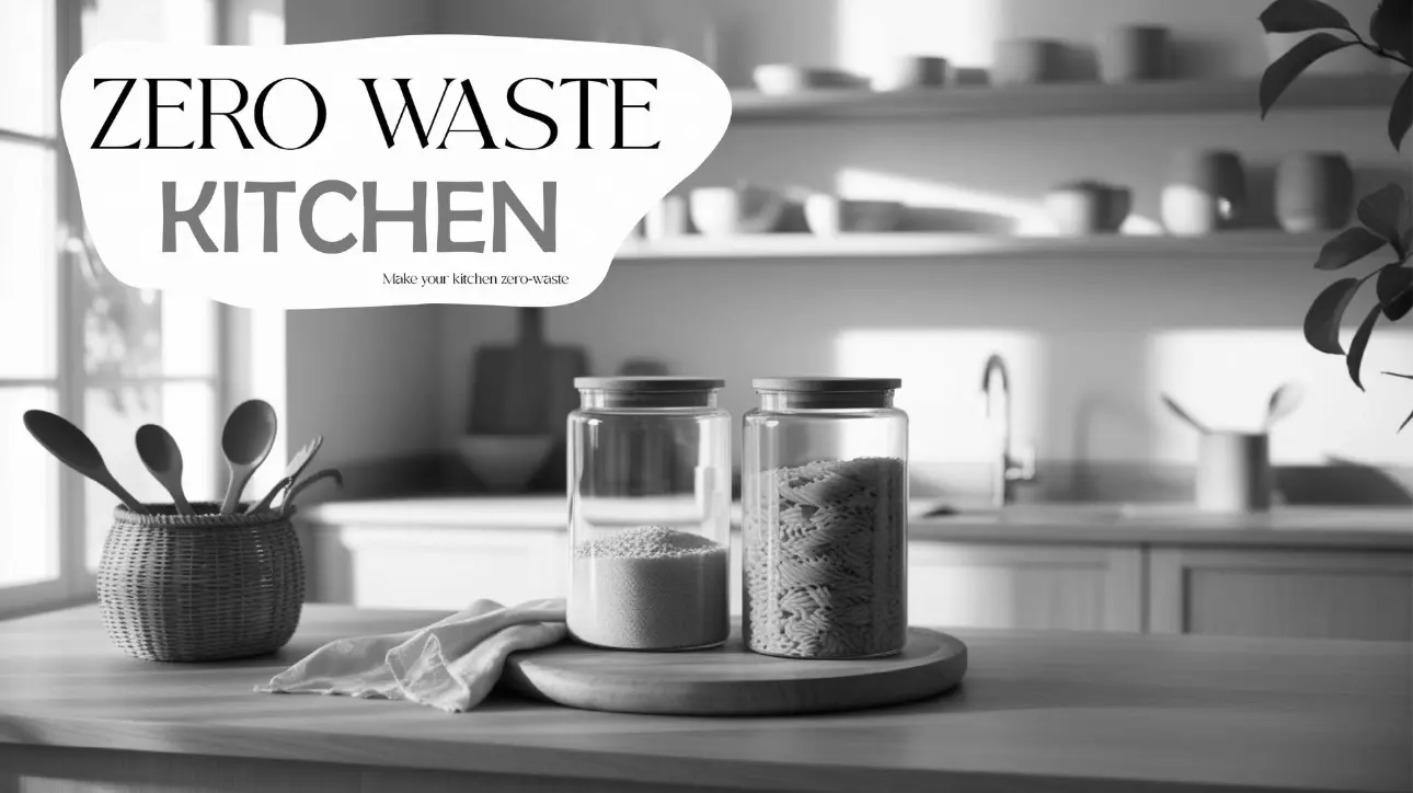
ECOSNAP - ZERO WASTE KITCHEN THUMBNAIL
Designing fresh, modern visuals for sustainability
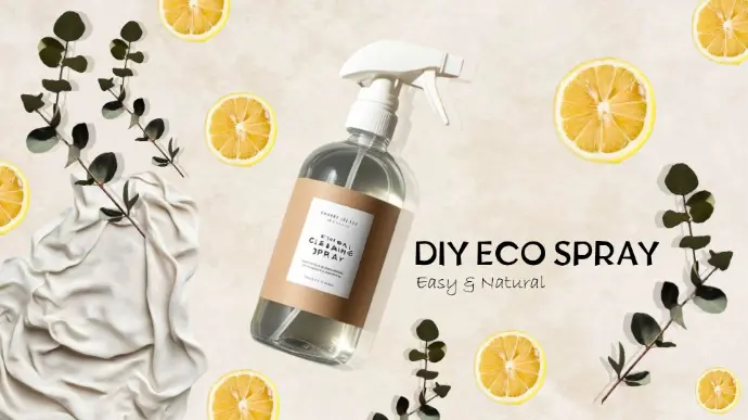
EcoSnap is an eco-living content brand focused on zero-waste hacks, sustainable product reviews, and eco-friendly DIYs.
This project reimagined their “Zero Waste Home” playlist with a modern, stylish thumbnail that makes sustainability feel fresh and aspirational.
The Brief
EcoSnap needed thumbnails that spoke “green” without falling into the clichés of eco-channel design. The goal was to balance
sustainability with modern appeal and make their playlist stand out in trending searches.
- Purpose: Strengthen identity for the “Zero Waste Home” YouTube playlist.
- Target Audience: Gen Z & Millennials into sustainability, slow living, and home improvement.
- Goal: Fresh, inviting, premium thumbnails that avoid generic eco styles.
- Goal: Fresh, inviting, premium thumbnails that avoid generic eco styles.
The Starting Point
No sketches were developed for this project. Instead, the focus was on visual strategy—
thinking through how colors, layout, and typography could express sustainability in a clean, modern way.
The Outcome
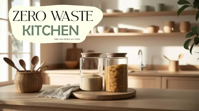
Large display of the final thumbnail
- Why the design works:
• Typography: Bold yet approachable, easy to read at a glance.
• Colors: Natural tones that suggest freshness without clichés.
• Composition: Clean layout with focus on lifestyle and eco-living.
• Colors: Natural tones that suggest freshness without clichés.
• Composition: Clean layout with focus on lifestyle and eco-living.
What This Project Shows
This project demonstrates how design strategy can transform eco-friendly messaging into
a premium, stylish identity. Even without a sketch-to-final journey, strong creative direction
can make sustainability visually aspirational.
Want designs that turn everyday ideas into standout visuals?